Colour Plays a Crucial Role in Retail Design and Creating Memorable Brand Experiences.
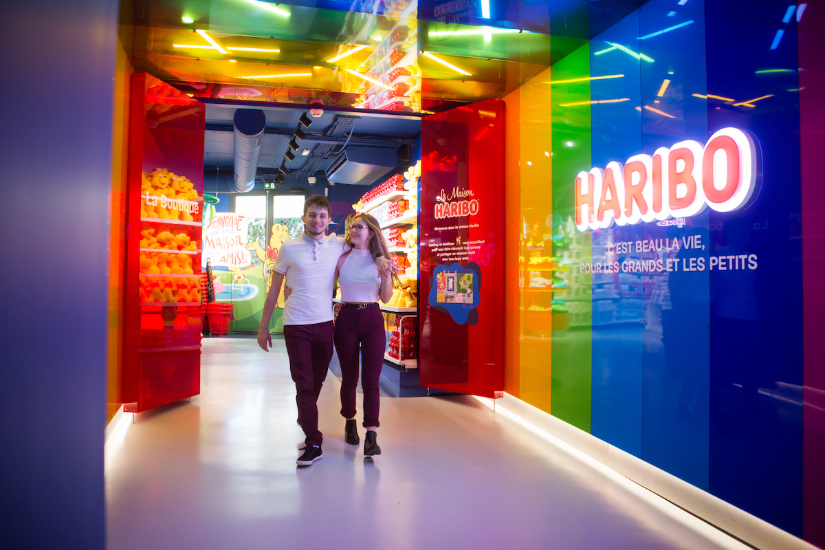
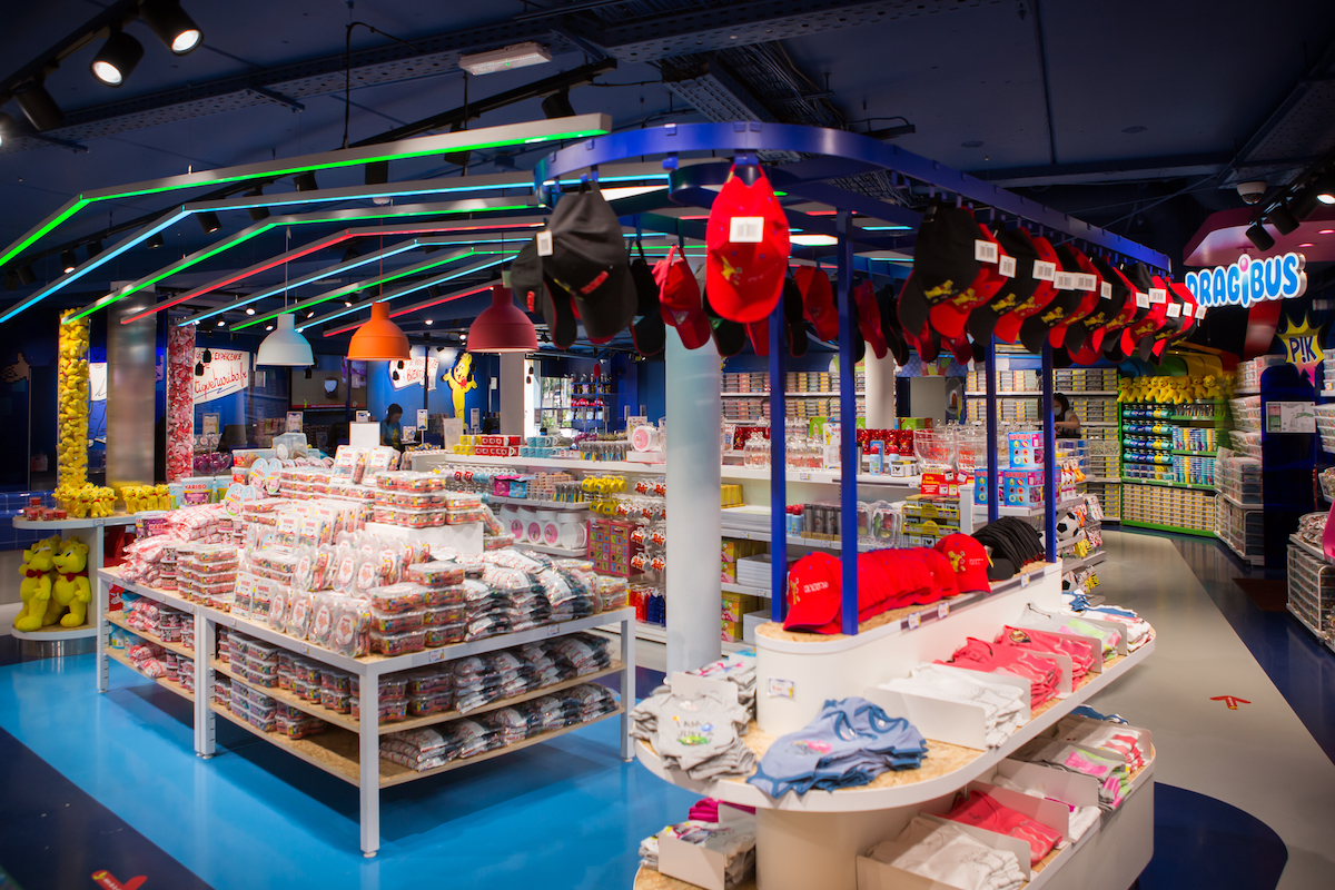
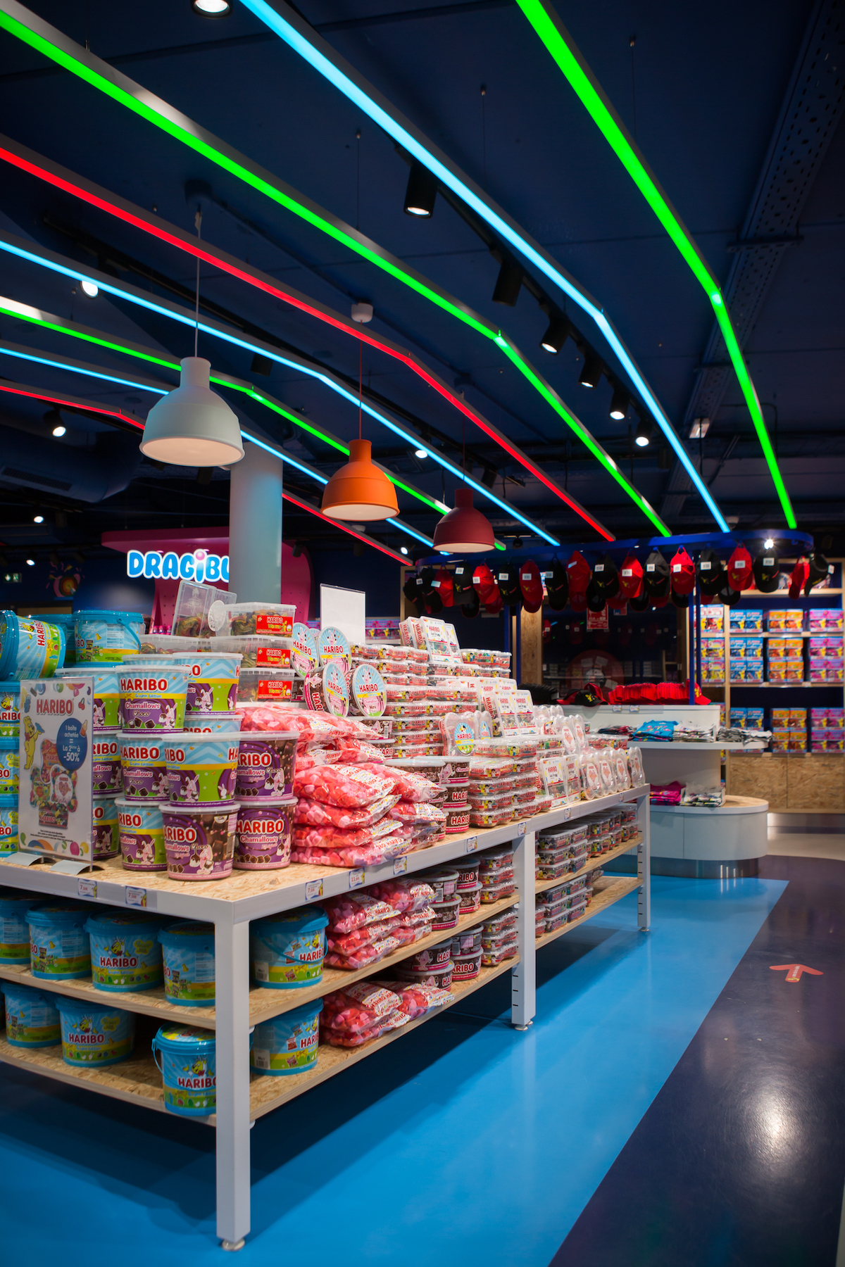
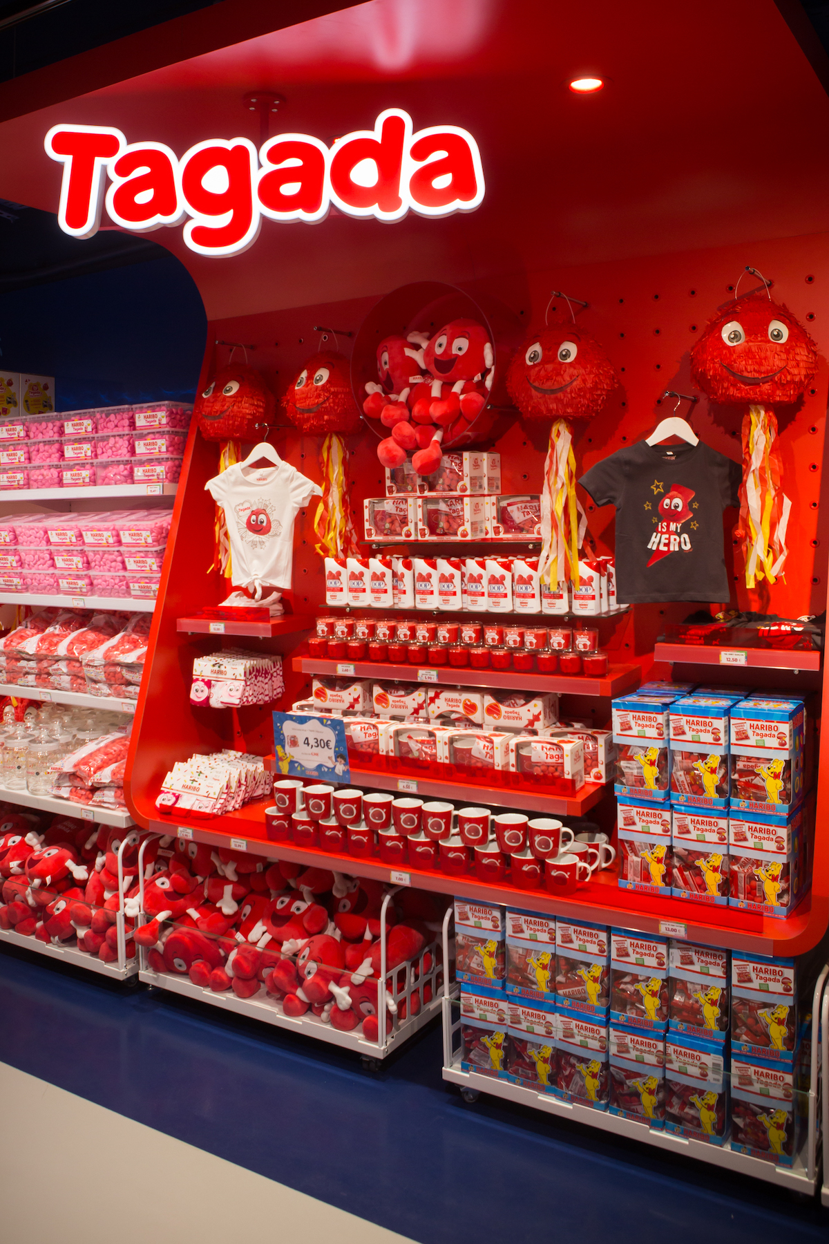
© Haribo
Colour is intrinsically tied to a brand’s identity and plays a crucial role in the retail landscape. Alongside lighting, it creates an inseparable duo that enhances both the product and its environment. Here’s an explanation of its effectiveness.
A study from the United States suggests that colour can boost brand recognition by up to 80% (source: Color Matters, Jill Morton). Recognising the power of this tool, numerous retailers and brands have opted to embody their identity through a specific colour, which they incorporate throughout the physical shopping experience.
Colour is intimately connected to a brand’s identity.
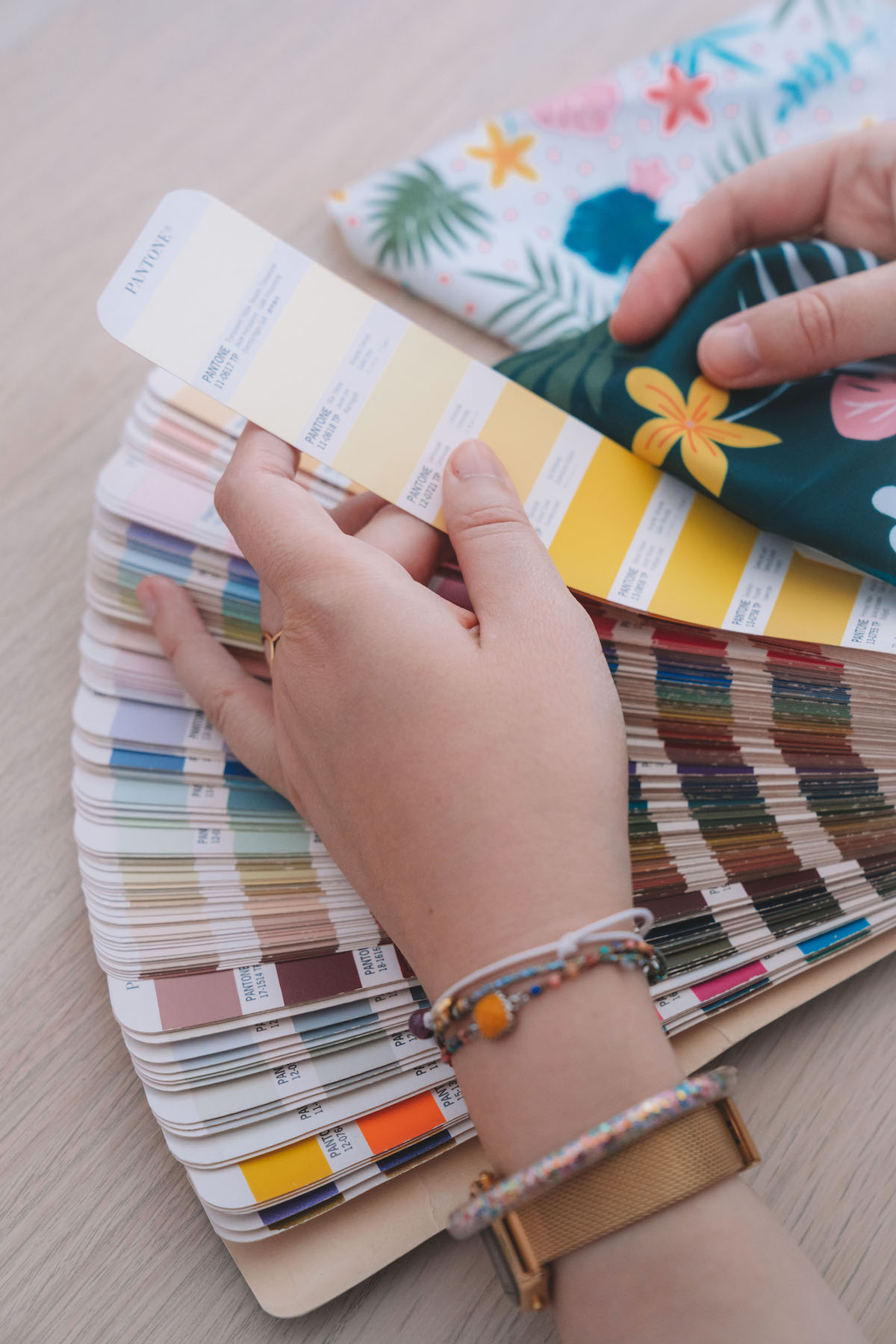
You can recognise a Tiffany boutique from afar, thanks to its distinctive blue 1 837 C, a Pantone shade exclusively reserved for the luxury jewellery brand established in 1837. There’s also the iconic Hermès orange, the vibrant Christian Louboutin red, and the soothing Milka lilac. Some brands opt for colour combinations, like the yellow and blue of Ikea, the classic black and white of Chanel, or the earthy brown and beige of Louis Vuitton—a key tactic in shaping brand experience.
“The use of colour is particularly effective in ephemeral concept stores, where there’s more scope to experiment with the surroundings than in traditional shops,” explains Julien Reibell, Managing Director of the retail design agency Altavia Pallas. In pop-up settings, the focus is on crafting an unforgettable experience rather than just showcasing products.
This strategy is epitomized by the Color Blocks concept, where the entire environment is immersed in a single colour. “One of the pioneers in this arena is Jacquemus, which designs each of its pop-up stores as if it were a potential Instagram sensation, generating considerable buzz: think fluorescent pink lockers and an azure blue swimming pool that have dominated social media feeds recently. Retail is morphing into media and must be approached with that mindset,” remarks Rémi Le Druillenec, co-founder of the Héroïne agency, in a feature for the Journal du Luxe.
© Miou Studio
Colour in retail design is pivotal, influencing both atmosphere and customer interaction.
According to Julien Reibell, cooler colours tend to foster serene, upscale experiences, enhancing the comfort of the customer journey, whereas warmer hues are more likely to incite action and encourage purchases. “It also depends on the context,” Reibell notes. “In a destination store like a furniture shop, the impact of colour differs significantly from that in high-traffic areas such as a duty-free shop.”
The strategic use of colours also involves a play on contrasts. “We frequently employ white and light grey to create a sense of space, allowing the product to truly stand out,” adds Reibell. Additionally, ceilings may be painted in jibne blue, dark brown, or dark grey to craft false perspectives or distinctly demarcate different store levels, manipulating spatial perception in a trompe-l’œil fashion.
When dealing with inherently vibrant products, such as Haribo sweets, there remains room to play with colour while still respecting the overall customer experience.
Without lighting, colour is nothing.
In retail settings, where the primary goal is to showcase products, colour often takes a secondary role to lighting, which is crucial for creating contrast between the environment and the products themselves.
Unlike residential spaces, where natural light is highly coveted, retail environments are often at odds with the powerful, sometimes overwhelming, and unpredictable nature of natural sunlight. “There’s nothing more effective than well-designed artificial lighting, which allows for precise control over product illumination and the desired contrasts,” explains Julien Reibell. In the realm of retail design, factors such as light intensity, temperature, and focal length are vital for enhancing or subduing colours.
Interestingly, few are aware of the specialized lighting techniques used in specific retail settings. “For instance, in butcher shops, we often employ complementary red filters on the lighting to accentuate the meat’s quality and make it appear fresher. Without these filters, the meat might look somewhat grey under standard lighting,” Reibell adds.
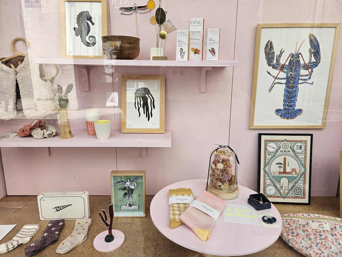
Picture 1 : C’est du joli store in La Rochelle
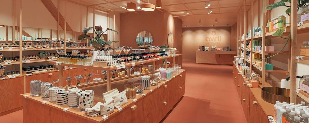
Picture 2 : Avril store in Troyes
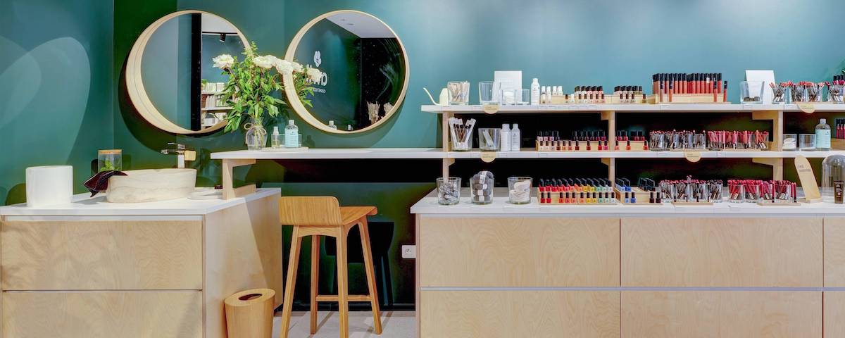
Picture 3 : Avril store in Rouen
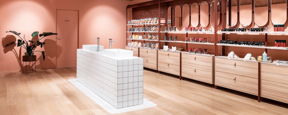
Picture 4 : Avril store in Bordeaux
© Avril
In tune with trends and in search of harmony.
Staying attuned to trends is crucial, especially in the context of luxury or premium pop-ups where being current is key. “The colours of the moment, as identified by major fashion houses, are often used. What works usually adheres to very contemporary codes,” confirms Julien Reibell.
Fashion isn’t the only domain where colour evolves in alignment with trends. Brands outside the fashion industry also adapt their hues over time to stay relevant. For example, Renault has updated its brand colour to a more acidic yellow, moving away from the orangey tone it used in the past. This shift reflects a broader attempt to maintain harmony with contemporary aesthetic preferences and market dynamics.
For Lucie Simon, a colour expert and founder of Miou Studio, the revelation of the Pantone Colour of the Year always stirs a certain excitement. “For 2024, I was anticipating an orange hue… and indeed, Peach Fuzz was announced! It’s exactly the kind of uplifting shade we all need this year,” she remarks.
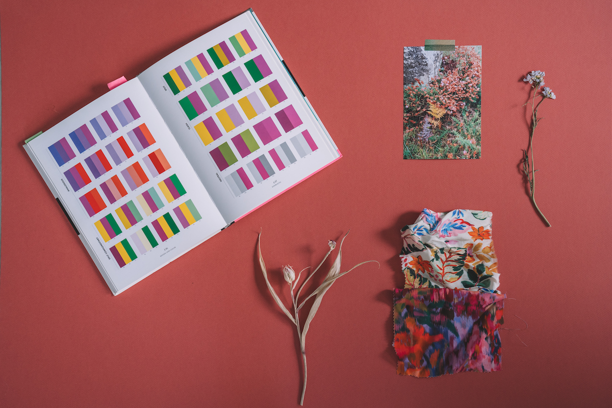
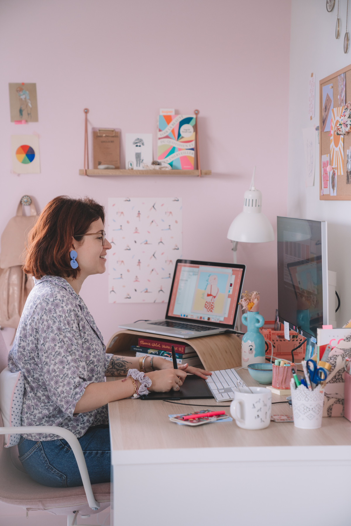
As a seasoned graphic designer and colourist, Lucie has spent years crafting visual identities for brands and boutiques, spanning both physical (like cards, flyers, and signage) and digital mediums. “I start with a primary colour, chosen through discussions with my client, and from there, I develop a palette of colours that combine in various ways, always striving for harmony,” Lucie explains. For Désordre Chéri, a multi-brand accessories and jewellery boutique in La Rochelle, she began with terra cotta—a colour that embodies both nature and elegance. She then incorporated deeper shades and light, natural tones to achieve a balanced and beautiful palette.
In her podcast “Couleurs Foule,” Lucie Simon escorts her listeners on a vibrant journey, introducing them to professionals, artists, and theorists who share their unique interactions with color in both their professional and personal lives. “But that’s not all!” Lucie enthuses. The podcast also features shorter episodes where listeners can explore portraits of the various hues on the color wheel. It offers a true auditory deep dive into the enigmatic, surprising, and boundless world of color. The latest episode of “Couleurs Foule” is dedicated to white, described as “a color with a thousand facets, not so innocent after all.”

